
Let’s connect
Let’s connect
Let’s connect
Let’s connect
Let’s connect
Let’s connect

Enhancing Validations: Feature Redesign
Enhancing Validations: Feature Redesign
What?
Reducing churn by increasing trust for Nexoya.
What?
Reducing churn by increasing trust for Nexoya.
How?
Increasing retention by redesigning / reframing a validations data feature to show transparency and increase trust.
How?
Increasing retention by redesigning / reframing a validations data feature to show transparency and increase trust.
AI
UX/UI Design
B2B
Webapp
Feature
Analytics
Overview
Overview
🤔 What is Nexoya?
🤔 What is Nexoya?
👉 Nexoya is a Zürich-based cross-channel ad optimisation integration tool.
Show more
👉 Nexoya is a SaaS cross-channel marketing tool.
👉 Nexoya is a Zürich-based cross-channel ad optimisation integration tool.
Show more
👉 Nexoya is a Zürich-based cross-channel ad optimisation integration tool.
Show more
🤔 What stakeholders did I work with?
🤔 What stakeholders did I work with?
👉 I worked closely together with the CEO, Head of Product, CTO, Head of ML and developers.
👉 I worked closely together with the CEO, Head of Product, CTO, Head of ML and developers.
Tools used
Tools used
Figma

Notion
Challenge
Challenge
"Some users do not feel confident enough about the validity of our AI-powered predictions and how accurate they actually are. The analytics in the Detail Report side panel/drawer do not address user concerns".
"Some users do not feel confident enough about the validity of our AI-powered predictions and how accurate they actually are. The analytics in the Detail Report side panel/drawer do not address user concerns".
"Some users do not feel confident enough about the validity of our AI-powered predictions and how accurate they actually are. The analytics in the Detail Report side panel/drawer do not address user concerns".
Affected Languages
Affected Languages
🇺🇸 English (American English)
Approach/Process
Approach/Process
Approach
Approach
While it was clear we needed to work our collaborative design magic for an effective redesign, we had a tried and tested example of what wasn't "effective enough" - i.e. the current design. A redesign mirrors many similar themes to that of a whole new MVP design, and the detailed design process was as follows:
While it was clear we needed to work our collaborative design magic for an effective redesign, we had a tried and tested example of what wasn't "effective enough" - i.e. the current design. A redesign mirrors many similar themes to that of a whole new MVP design, and the detailed design process was as follows:
Empaphise
Understand the user.
What are the goals, needs, wants and frustrations?
Define
Define the problem.
What needs to be solved, and how do we do it?
Ideate
Conceptualise designs: Bring ideas to life.
Information architecture and element UX form.
Refine
Iterate and focus on the smaller details.
Prototype
and test
Create a solid prototype to test with our CSMs.
Does this solution add value?
Refine
as needed
Incorporate user feedback into the design solution
Deliver
Final check: Rollout and hand-over design solution to the development team.
1.Empaphise
Understand the user.
What are the goals, needs, wants and frustrations?
2.Define
Define the problem.
What needs to be solved, and how do we do it?
3.Ideate
Conceptualise designs: Bring ideas to life.
Information architecture and element UX form.
4.Refine
Iterate and focus on the smaller details.
5.Prototype
and test
Create a solid prototype to test with our CSMs.
Does this solution add value?
6.Refine
as needed
Incorporate user feedback into the design solution
7.Deliver
Final check: Rollout and hand-over design solution to the development team.
Define
Define
What needs to be solved?
What needs to be solved?
Based on data analysis and qualitative feedback through user interviews, some users were concerned with:
❌ What is Gain/Loss? How accurate are these statistics, and what are they?
❌ Subscription value: The value of their subscription to continue.
❌ ML-data transparency: How do they fare against real results, and how do we predict data?
❌ Previous design to be redone: (Demonstrated with old Figma screens)
❌ Previous design to be redone: (Demonstrated with old Figma screens)
❌ Main user friction point: What is gain/loss? What do these figures mean?

?
Myself, the Head of Product and Head of Machine Learning (ML) came together, and identified 3 key themes of the "What" to focus on throughout the design process. They are:
Myself, the Head of Product and Head of Machine Learning (ML) came together, and identified 3 key themes of the "What" to focus on throughout the design process. They are:
📈
Data Transparency
We must show how we calculate our predictions, and show the data in a scannable way.
✨
AI
Validity
How accurate is the ML-predicted data, and how does it match up with real data?
💸
Subscription
Value
Highlight the value users are getting from their subscription with the SaaS tool.
📈
Data Transparency
We must show how we calculate our predictions, and show the data in a scannable way.
✨
📈
AI Validity
Data Transparency
How accurate is the ML-predicted data, and how does it match up with real data?
We must show how we calculate our predictions, and show the data in a scannable way.
✨
AI
Validity
How accurate is the ML-predicted data, and how does it match up with real data?
💸
Subscription Value
Subscription
Value
Highlight the value users are getting from their subscription with the SaaS tool.
Highlight the value users are getting from their subscription with the SaaS tool.
📈
Data Transparency
We must show how we calculate our predictions, and show the data in a scannable way.
✨
AI
Validity
How accurate is the ML-predicted data, and how does it match up with real data?
💸
Subscription
Value
Highlight the value users are getting from their subscription with the SaaS tool.
Ideate phase 1
Ideate phase 1
Conceptualise: Bring ideas to life in an initial version to get the ball rolling.
Conceptualise: Bring ideas to life in an initial version to get the ball rolling.
This design phase is largely conceptual. It involves starting the design momentum and working towards something "less wrong" per iteration. While it's unlikely these will be used in their purest form, it does provide a clear insight into what works, and what doesn't. We addressed the following themes above with:
This design phase is largely conceptual. It involves starting the design momentum and working towards something "less wrong" per iteration. While it's unlikely these will be used in their purest form, it does provide a clear insight into what works, and what doesn't. We addressed the following themes above with:
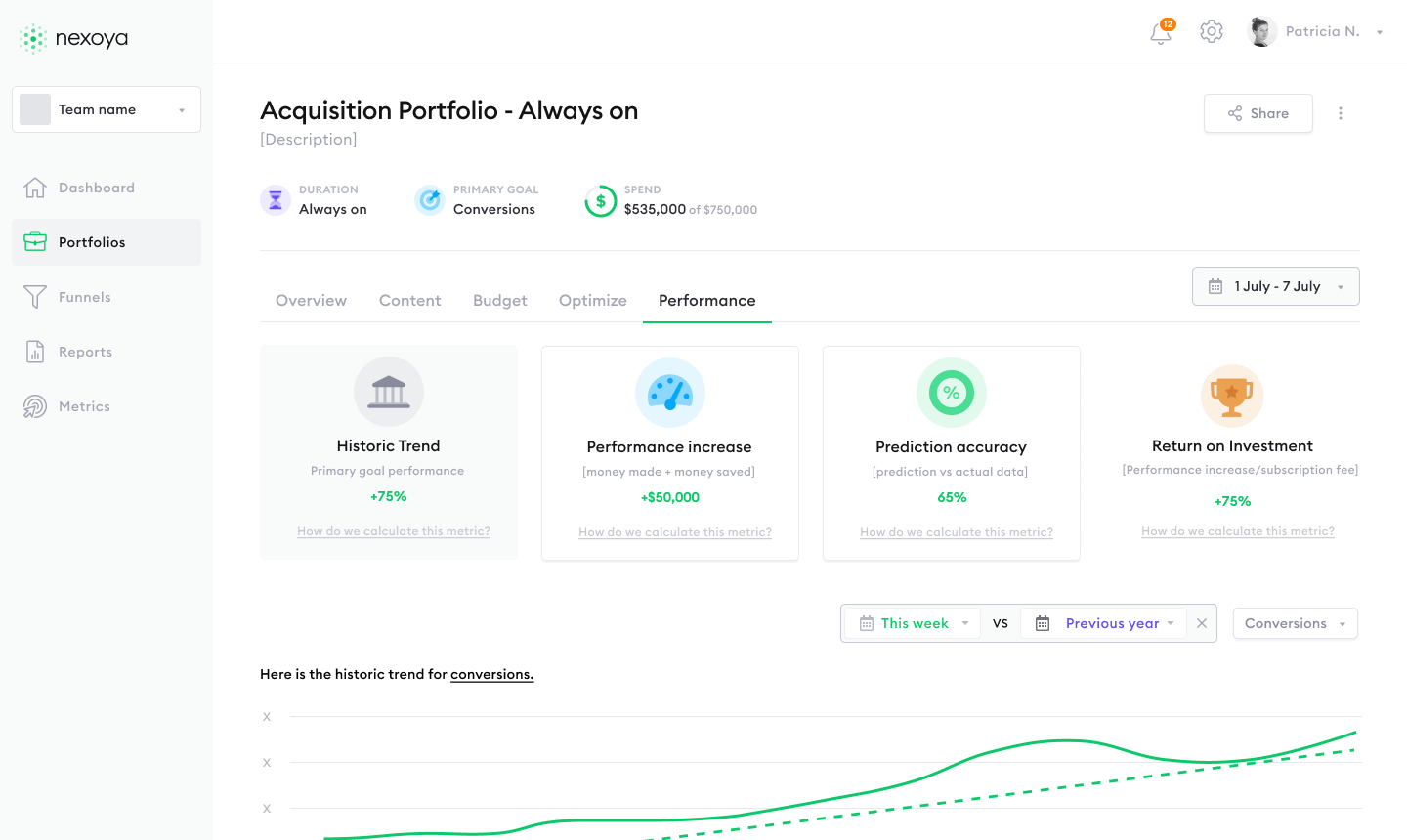
📈 Data Transparency
Inclusion of sub-categories: Historic trend, Performance increase, Prediction Accuracy
Inclusion of sub-categories: Historic trend, Performance increase, Prediction Accuracy
✨ AI Validity
Emphasis on easy-to-scan Prediction Accuracy score and transparent content budget changes in Performance Increase
Emphasis on easy-to-scan Prediction Accuracy score and transparent content budget changes in Performance Increase
💸 Subscription Value
Inclusion of overall "Return on Investment" value (performance increase/subscription fee)
Inclusion of overall "Return on Investment" value (performance increase/subscription fee)
First ideation (Mid-fi)
First ideation (Mid-fi)
Although the first ideations are very rarely used as part of the final solution, key features and ideas were starting to take shape.
Although the first ideations are very rarely used as part of the final solution, key features and ideas were starting to take shape.
Ideate phase 2
Ideate phase 2
Experimenting and setting the information architecture.
Experimenting and setting the information architecture.
While the initial design had been created and key solutions to particular use cases / user needs were starting to take shape, it was just as integral to decide where they would live in the product's information architecture.
While the initial design had been created and key solutions to particular use cases / user needs were starting to take shape, it was just as integral to decide where they would live in the product's information architecture.
Information Architecture V1: Combination of existing "performance" with new screens.
Information Architecture V1: Combination of existing "performance" with new screens.
Information Architecture V2: Cards to Switchers
Information Architecture V2: Cards to Switchers
Result:
Result:
We went with Version 2.
Why?
From feedback and general SaaS best practices, we wanted to move away form large icons and cards as a focal point for the screen, and integrate the new features into our current information architecture style the user is already used to.
Furthermore, a focus on switchers allows more user focus to be placed on the data itself, as well as being able to integrate the loved tried and tested Nexoya funnel into the design.
Refine
Refine
Iterate and focus on the smaller details.
Iterate and focus on the smaller details.
Key themes
I: Simulation homepage / create simulation wizard
✅ UX Writing: Optimised sub-category naming. i.e. Performance increase -> Insights
✅ UX Writing: Optimised sub-category naming. i.e. Performance increase -> Insights
✅ Tool value: Emphasis of "optimised/non-optimised" in the Insights sub-category
✅ Tool value: Emphasis of "optimised/non-optimised" in the Insights sub-category
✅ Learnability. Inclusion of side-drawer explainer steps for Prediction accuracy (to explain the 20% threshold logic)
✅ Learnability. Inclusion of side-drawer explainer steps for Prediction accuracy (to explain the 20% threshold logic)
Prototype and test
Prototype and test
Create a solid prototype to test with real users. Does our solution add value?
Create a solid prototype to test with real users. Does our solution add value?
All Figma screens for this feature were thoughtfully linked together into a prototype, allowing us to test our solution effectively.
Who participated in the testing?
The testers were divided into two primary groups:
Our internal Customer Success Managers (CSMs), who interact with clients on a daily basis
The clients themselves
And how was the solution received?
✅ Our strong foundational design approach appeared to have paid off, as the solution was very well received. Users found the features intuitive to navigate and use on their own, largely thanks to the integration of the familiar Nexoya funnel.
❓ That said, some users expressed concerns about potential distractions caused by the placement of the analytics validation features, which were located under the "performance" section. Moreover, some users felt that too much information was being packed into the overview page, which may contribute to cognitive load.
Refine as needed
Refine as needed
Incorporate user feedback into the design solution
Incorporate user feedback into the design solution
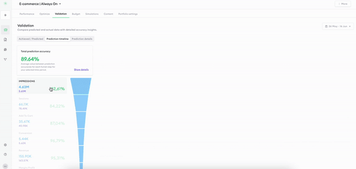
Solution: Creation of a whole new category: Validation.
Solution: Creation of a whole new category: Validation.
To address the concern around feature placement and reduce cognitive load, we introduced an entirely new category: Validation. This allowed us to separate analytics validation from performance-related content, making the experience more focused, intuitive, and easier to navigate for users.
This new category would also contain sub-categories aimed reduce cognitive load, and allow the user to explore individual "validation" analytics. This includes sub-category pages for achieved / predicted, prediction timeline and a prediction details.
Solution
Solution
✅ Creation of Validation page: 2nd level (to live on the navigation rail)
✅ Overview -> Achieved / Predicted.
✅ Inclusion of Prediction Timeline
✅ Inclusion of Prediction Details
✅ Creation of Validation page: 2nd level (to live on the navigation rail)
✅ Overview -> Achieved / Predicted.
✅ Inclusion of Prediction Timeline
✅ Inclusion of Prediction Details
Deliver
Deliver
Final check: Rollout and handover design solution to the development team.
Final check: Rollout and handover design solution to the development team.
Before handing over to dev, a final check was in order. This includes checking for final copy, consistencies and double-checking with wider members of the team before handoff.
Before handing over to dev, a final check was in order. This includes checking for final copy, consistencies and double-checking with wider members of the team before handoff.
Results
Results
Results
Outcome
Outcome
While hard data is still being gathered, the impact of this feature is already clear in terms of strategic value:
Built Trust, Reduced Churn:
By giving users confidence in their data through the new Validation category, we addressed a key pain point: Trust. When users trust what they see, they stick around.Increased Retention Through Confidence:
Validation tells users their insights are reliable, which directly supports long-term engagement and lowers the risk of churn.Business-Critical Design:
Trust in analytics is not a “nice to have”. It drives core business metrics. With this release, we didn’t just improve UX, but use good user experience to drive business value.
Project impact
Project impact
The project was based on a V2, acting to improve initial designs based on data and business direction.
As mentioned to the Nth degree throughout this case study, the theme of "trust" is invaluable in increasing retention metrics in SaaS. Trust brings transparency, and transparency brings user confidence in maintaining partnerships that positively impact both sides. Product design isn't always about creating something new, but improving what you already have in presenting it in a "manageable" way.
Project takeaways
Project takeaways
My personal takeaway: One thing that stuck with me is the value of a strong "Definition" phase of the design process together with key stakeholders.
By bringing in expertise from different areas of the company, including intricate customer knowledge and being aware of technical limitations, we could create something to ship relatively quickly. Therefore, foundations are key in saving time down the line.

How can I help your business? Let’s chat!
2025, Benjamin Bruton
How can I help your business? Let’s chat!
2025, Benjamin Bruton
How can I help your business? Let’s chat!
2025, Benjamin Bruton
How can I help your business? Let’s chat!
2025, Benjamin Bruton